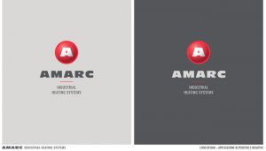
Amarc’s new logo: a symbol of continuous improvement
Amarc: A new logo for a tradition of excellence
The history of a company is not just about the products, projects, or services it offers. It is also about how it presents itself to the world. The logo, in particular, is often the first point of contact with partners and customers, and it represents the heart of the corporate identity.
That is why Amarc decided to renew its logo, a fundamental part of its image. In a world that is constantly changing, rapid, and interconnected, it is essential to communicate effectively.
A symbol of growth and evolution
Amarc has always worked in the field of industrial heat treatment, a complex world that requires new technologies and cutting-edge processes. In this dynamic context, it is necessary to evolve and update in order to continuously improve.
The renewal of the logo is not just an aesthetic operation, but a tangible symbol of the company’s growth and evolution.
Amarc firmly believes in the value of continuous improvement. In a world where innovation is the key to success, it is essential to keep up with the times and ensure that Amarc’s image reflects the same quality that can be found in its services.
The new design embodies the company’s desire to look to the future, while at the same time not forgetting its past and its long experience.
Features of the new logo
 Amarc’s logo has always represented the heart and soul of the company. It embodies years of hard work, success, and challenges overcome, and it conveys the passion that the company puts into its work every day.
That is why, even though the logo was renewed, Amarc wanted to stay true to its roots.
- Harmony and modernity: The new logo features fluid and harmonious lines that perfectly balance the past and the future, modernity and tradition. This choice reflects the company’s ability to adapt and transform without losing sight of its identity.
- Shading and shine: The shades are soft and delicate, giving the design depth and three-dimensionality, while also suggesting stability and solidity. These details are a reference to the company’s advanced solutions and high engineering.
- Colors: The colors of the new logo were carefully chosen to reflect the company’s core values. The red selected, halfway between vermilion and cinnabar, conveys energy, dynamism, creativity, passion, and innovation.
Beyond the logo: A renewed corporate vision
The renewal of the logo is a gesture that reflects the company’s commitment to continuous evolution, always ready to face the challenges of a rapidly changing market.
Amarc is not only a leader in the field of industrial heat treatment, but it also wants to be a model of how a company can reinvent itself while maintaining its roots and valuing its experience.
Why a renewal?
At Amarc, the concept of continuous improvement is at the foundation of every decision. The world is changing, and Amarc is changing with it. In an increasingly globalized and interconnected market, it is essential to be able to communicate effectively.
The new logo is the first of a series of renewals, a concrete sign of the company’s commitment to excellence.


